pacman::p_load(ggiraph,tidyverse, plotly, DT, ggplotly, patchwork,ggstatsplot, ggside)In-Class_Ex04
Getting Started
Load the packages
Data
exam_data <- read_csv("data/Exam_data.csv")
show_col_types = FALSEplot_ly(data = exam_data,
x = ~MATHS,
y = ~ENGLISH,
color = ~RACE,
colors = "Set1")Interactive scatter plot
p <- ggplot(data=exam_data,
            aes(x = MATHS,
                y = ENGLISH)) +
  geom_point(dotsize = 1) +
  coord_cartesian(xlim=c(0,100),
                  ylim=c(0,100))
ggplotly(p) #<<
Combine multiple plots with subplot()
p1 <- ggplot(data=exam_data,
              aes(x = MATHS,
                  y = ENGLISH)) +
  geom_point(size=1) +
  coord_cartesian(xlim=c(0,100),
                  ylim=c(0,100))

p2 <- ggplot(data=exam_data,
            aes(x = MATHS,
                y = SCIENCE)) +
  geom_point(size=1) +
  coord_cartesian(xlim=c(0,100),
                  ylim=c(0,100))
subplot(ggplotly(p1),            #<<
        ggplotly(p2))            #<<
Visual Statistics Analysis with ggstatsplot
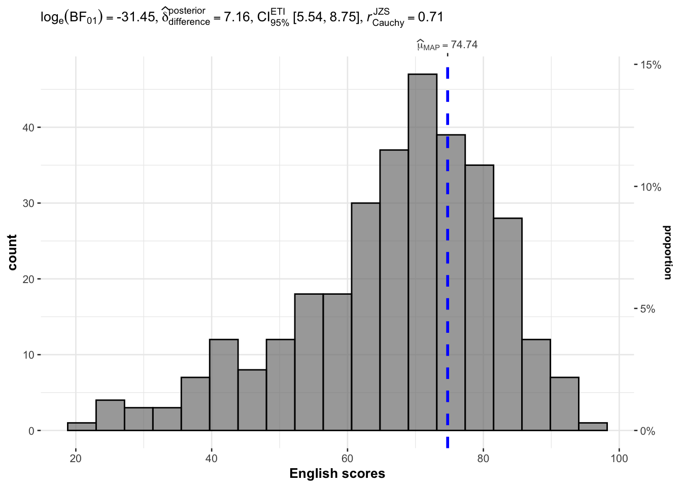
One Sample test with gghistostats()
set.seed(1234)

gghistostats(
  data = exam_data,
  x = ENGLISH,
  type = "bayes",
  test.value = 60,
  xlab = "English scores"
)
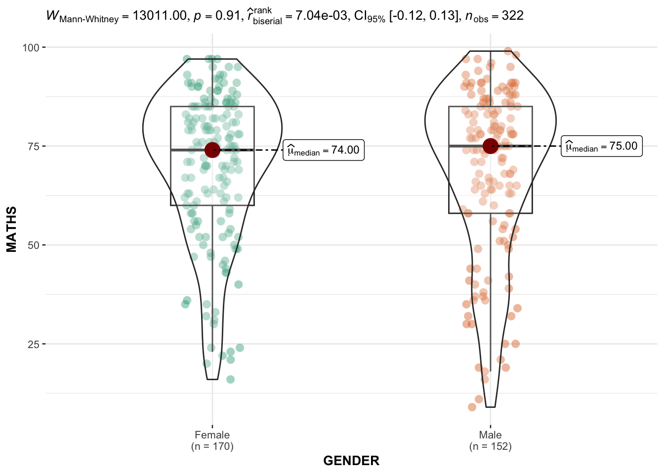
Two sample mean test using ggbetweenstats()
ggbetweenstats(
  data = exam_data,
  x = GENDER,
  y = MATHS,
  type = "np",
  messages = FALSE
)
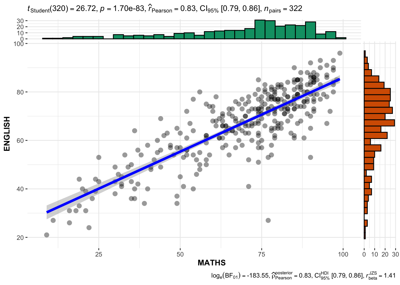
Significant Test of Correlation
ggscatterstats(
  data = exam_data,
  x = MATHS,
  y = ENGLISH,
  marginal = TRUE,
  )
Visualising Models
Load additional packages
pacman::p_load(readxl, performance, parameters, see)Read the data file this time using read_xls(_)
Read the data tab/ worksheet in the Excel file.
car_resale <- read_xls("data/ToyotaCorolla.xls",
                       "data")
car_resale
# A tibble: 1,436 × 38
Id Model Price Age_0…¹ Mfg_M…² Mfg_Y…³ KM Quart…⁴ Weight Guara…⁵
<dbl> <chr> <dbl> <dbl> <dbl> <dbl> <dbl> <dbl> <dbl> <dbl>
1 81 TOYOTA Cor… 18950 25 8 2002 20019 100 1180 3
2 1 TOYOTA Cor… 13500 23 10 2002 46986 210 1165 3
3 2 TOYOTA Cor… 13750 23 10 2002 72937 210 1165 3
4 3 TOYOTA Co… 13950 24 9 2002 41711 210 1165 3
5 4 TOYOTA Cor… 14950 26 7 2002 48000 210 1165 3
6 5 TOYOTA Cor… 13750 30 3 2002 38500 210 1170 3
7 6 TOYOTA Cor… 12950 32 1 2002 61000 210 1170 3
8 7 TOYOTA Co… 16900 27 6 2002 94612 210 1245 3
9 8 TOYOTA Cor… 18600 30 3 2002 75889 210 1245 3
10 44 TOYOTA Cor… 16950 27 6 2002 110404 234 1255 3
# … with 1,426 more rows, 28 more variables: HP_Bin <chr>, CC_bin <chr>,
# Doors <dbl>, Gears <dbl>, Cylinders <dbl>, Fuel_Type <chr>, Color <chr>,
# Met_Color <dbl>, Automatic <dbl>, Mfr_Guarantee <dbl>,
# BOVAG_Guarantee <dbl>, ABS <dbl>, Airbag_1 <dbl>, Airbag_2 <dbl>,
# Airco <dbl>, Automatic_airco <dbl>, Boardcomputer <dbl>, CD_Player <dbl>,
# Central_Lock <dbl>, Powered_Windows <dbl>, Power_Steering <dbl>,
# Radio <dbl>, Mistlamps <dbl>, Sport_Model <dbl>, Backseat_Divider <dbl>, …
# ℹ Use `print(n = ...)` to see more rows, and `colnames()` to see all variable namesBuild a multiple linear regression model using lm() of Base Stats of R
model <- lm(Price ~ Age_08_04 + Mfg_Year + KM +
              Weight + Guarantee_Period, data = car_resale)
model
Call:
lm(formula = Price ~ Age_08_04 + Mfg_Year + KM + Weight + Guarantee_Period,
    data = car_resale)

Coefficients:
     (Intercept)         Age_08_04          Mfg_Year                KM
      -2.637e+06        -1.409e+01         1.315e+03        -2.323e-02
          Weight  Guarantee_Period
       1.903e+01         2.770e+01
Diagnostic Test of Model
check_collinearity(model)# Check for Multicollinearity
Low Correlation
Term VIF VIF 95% CI Increased SE Tolerance Tolerance 95% CI
Guarantee_Period 1.04 [1.01, 1.17] 1.02 0.97 [0.86, 0.99]
Age_08_04 31.07 [28.08, 34.38] 5.57 0.03 [0.03, 0.04]
Mfg_Year 31.16 [28.16, 34.48] 5.58 0.03 [0.03, 0.04]
High Correlation
Term VIF VIF 95% CI Increased SE Tolerance Tolerance 95% CI
KM 1.46 [1.37, 1.57] 1.21 0.68 [0.64, 0.73]
Weight 1.41 [1.32, 1.51] 1.19 0.71 [0.66, 0.76]Visualise the multicollinearity report
(<5 no multi-collinearity; >=10: high multi-collinearity)
check_c <- check_collinearity(model)
plot(check_c)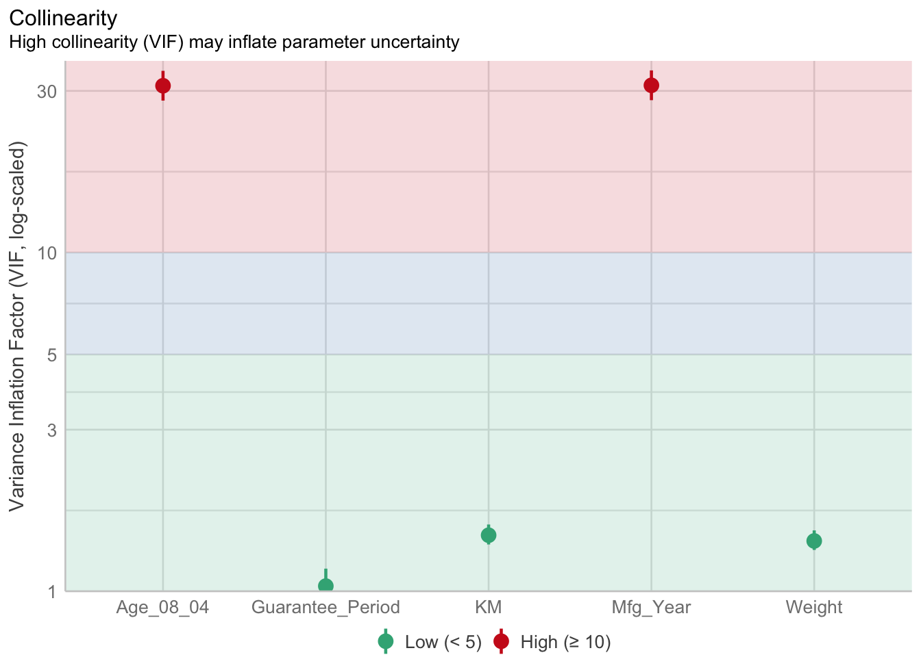
Check normality assumption using check_normality() from performance package
model1 <- lm(Price ~ Age_08_04 + KM +
              Weight + Guarantee_Period, data = car_resale)
check_n <- check_normality(model1)
plot(check_n)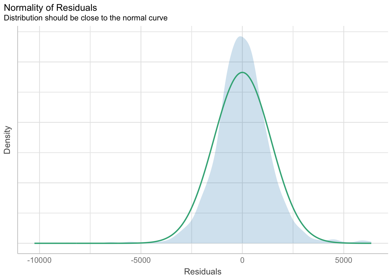
Check model for homogeneity of variances
check_h <- check_heteroscedasticity(model1)
plot(check_h)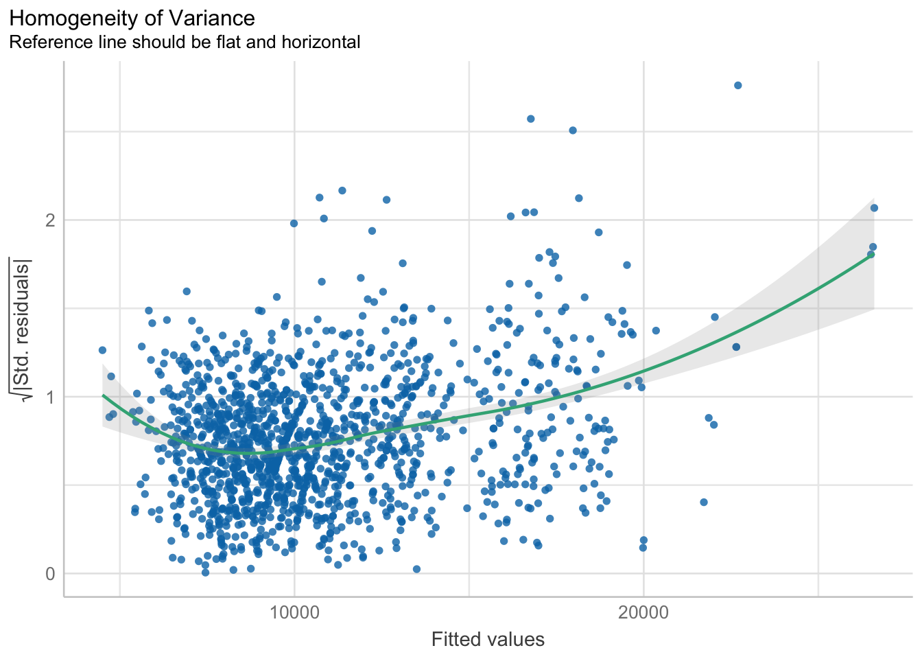
Complete check model diagnostic
check_model(model1)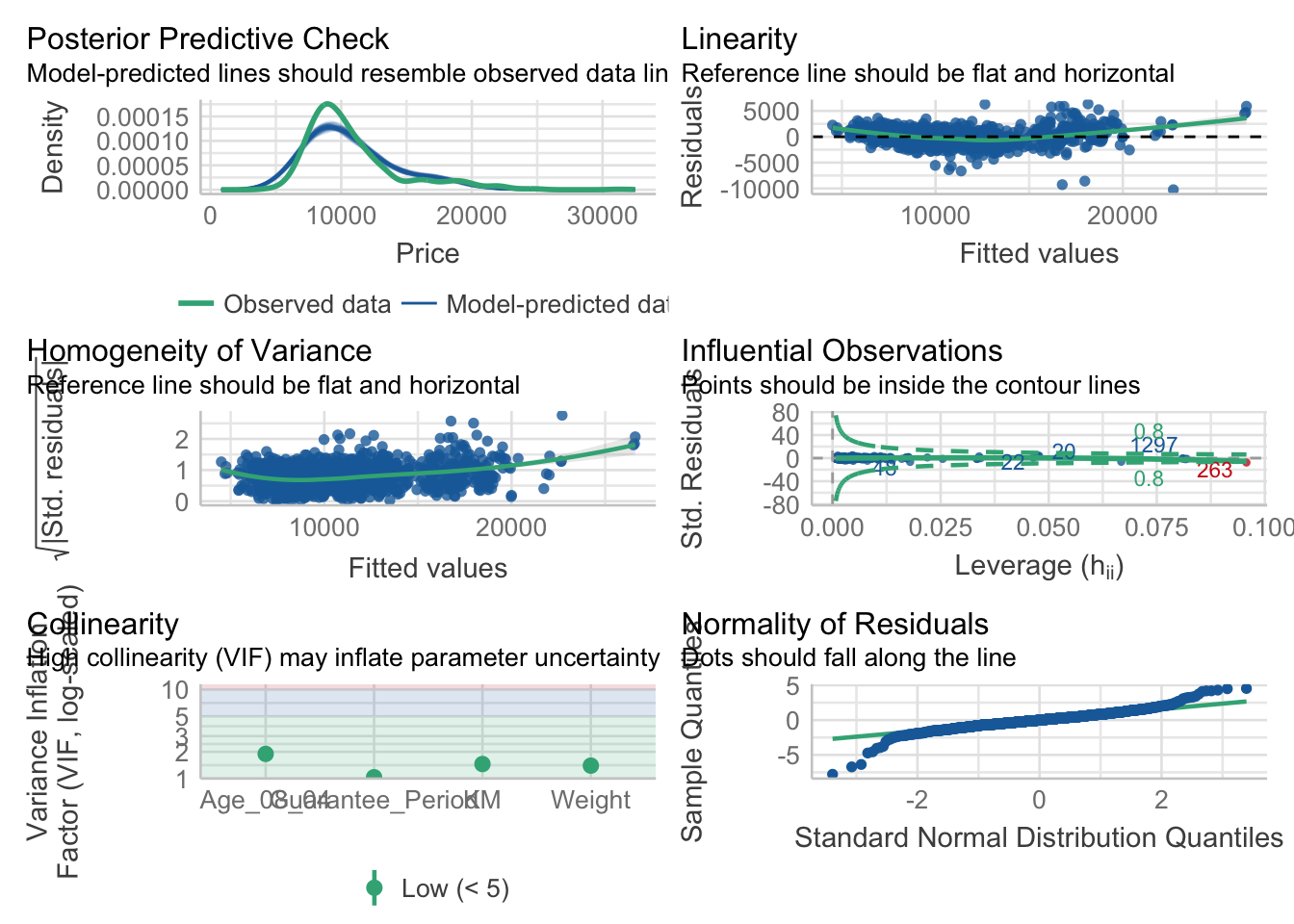
Visualising regression parameters
plot(parameters(model1))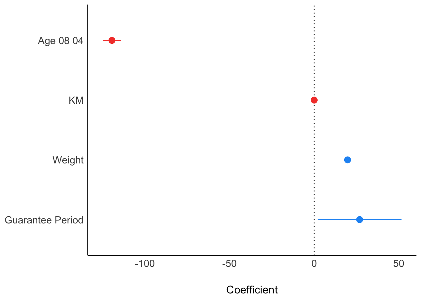
Using ggcoefstats() from ggstatsplot package
ggcoefstats(model1,
            output = "plot")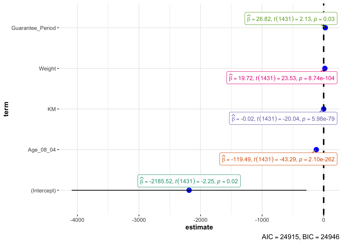
Visualizing the uncertainty
pacman::p_load(tidyverse, plotly, crosstalk, DT, ggdist, gganimate)
exam <- read_csv("data/Exam_data.csv")
Using ggplot2 to save the output as a tibble data
my_sum <- exam %>%
  group_by(RACE) %>%
  summarise(
    n=n(),
    mean=mean(MATHS),
    sd=sd(MATHS)
    ) %>%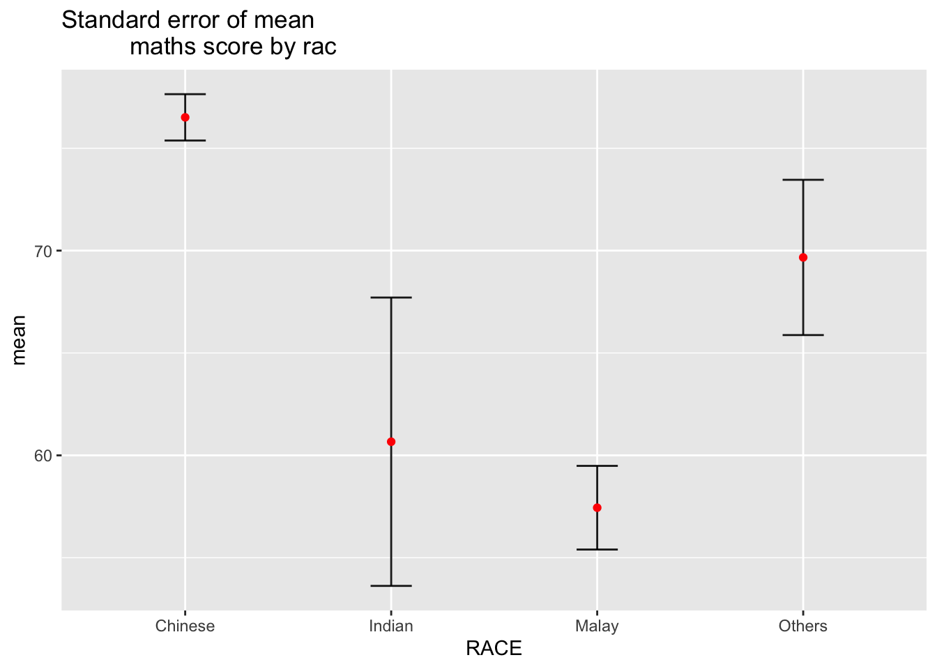
mutate(se=sd/sqrt(n-1))knitr::kable(head(my_sum), format = 'html')| RACE | n | mean | sd | se |
|---|---|---|---|---|
| Chinese | 193 | 76.50777 | 15.69040 | 1.132357 |
| Indian | 12 | 60.66667 | 23.35237 | 7.041005 |
| Malay | 108 | 57.44444 | 21.13478 | 2.043177 |
| Others | 9 | 69.66667 | 10.72381 | 3.791438 |
Then visualise standard error of mean maths score by race
ggplot(my_sum) +
  geom_errorbar(
    aes(x=RACE,
        ymin=mean-se,
        ymax=mean+se),
    width=0.2,
    colour="black",
    alpha=0.9,
    size=0.5) +
  geom_point(aes
           (x=RACE,
            y=mean),
           stat="identity",
           color="red",
           size = 1.5,
           alpha=1) +
  ggtitle("Standard error of mean
          maths score by rac")