pacman::p_load(ggiraph,tidyverse, plotly)In-Class_Ex03
Installing and loading R packages
Two packages will be installed and loaded: tidyverse and ggiraph.
Import data
exam_data <- read_csv("data/Exam_data.csv")
show_col_types = FALSE
ggplot2
ggplot(data=exam_data, aes(x = MATHS)) +
  geom_histogram(bins = 10,
                 boundary = 100,
                 color="black",
                 fill="grey") +
  ggtitle("Distribution of maths scores")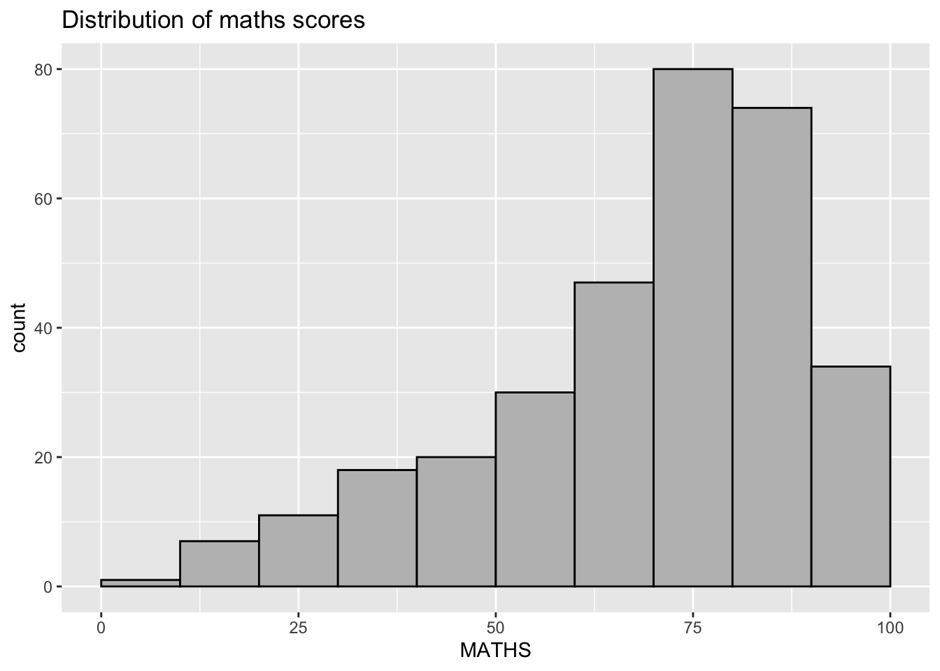
Dot Plot
ggplot(data=exam_data,
       aes(x = MATHS)) +
  geom_dotplot(dotsize = 0.5)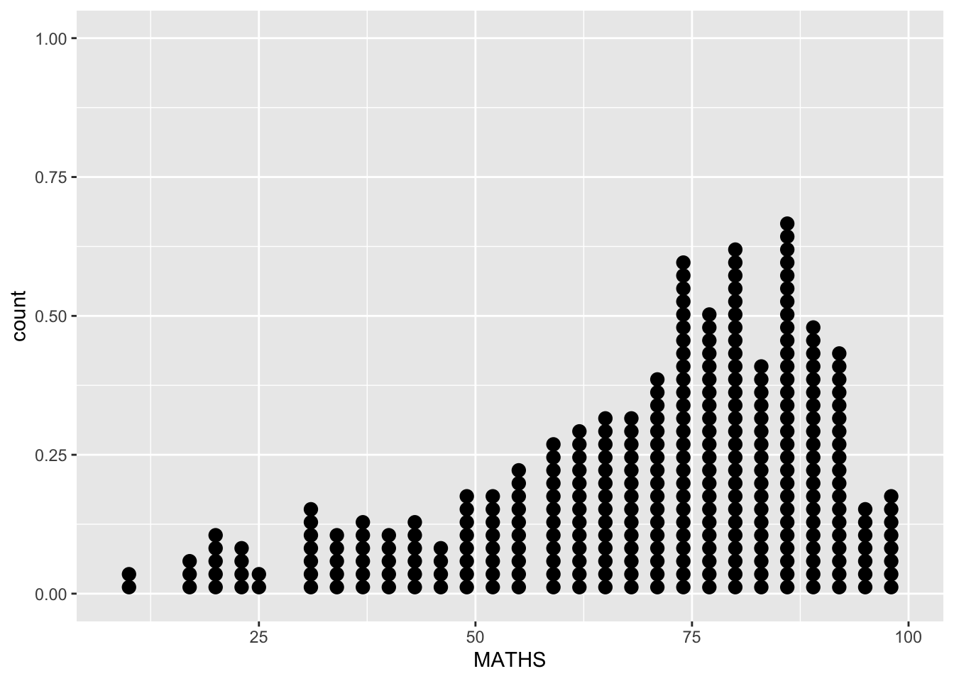
Visual Interactivity with girafe
p <- ggplot(data=exam_data,
       aes(x = MATHS)) +
  geom_dotplot_interactive(
    aes(tooltip = ID),
    stackgroups = TRUE,
    binwidth = 1,
    method = "histodot") +
  scale_y_continuous(NULL,
                     breaks = NULL)

girafe(
  ggobj = p,
  width_svg = 6,
  height_svg = 6 * 0.618
)
To display multiple information on tooltip
exam_data$tooltip <- c(paste0(     #<<
  "Name = ", exam_data$ID,         #<<
  "\n Class = ", exam_data$CLASS)) #<<

p <- ggplot(data=exam_data,
       aes(x = MATHS)) +
  geom_dotplot_interactive(
    aes(tooltip = exam_data$tooltip), #<<
    stackgroups = TRUE,
    binwidth = 1,
    method = "histodot") +
  scale_y_continuous(NULL,
                     breaks = NULL)
girafe(
  ggobj = p,
  width_svg = 8,
  height_svg = 8*0.618
)
Customize tooltip: change background and font.
tooltip_css <- "background-color:white; #<<
font-style:bold; color:black;" #<<

p <- ggplot(data=exam_data,
       aes(x = MATHS)) +
  geom_dotplot_interactive(
    aes(tooltip = ID),
    stackgroups = TRUE,
    binwidth = 1,
    method = "histodot") +
  scale_y_continuous(NULL,
                     breaks = NULL)
girafe(
  ggobj = p,
  width_svg = 6,
  height_svg = 6*0.618,
  options = list(    #<<
    opts_tooltip(    #<<
      css = tooltip_css)) #<<
)
To add in statistics on tooltip
We write in function and pass mean, standard error, and paste them onto the plot.
tooltip <- function(y, ymax, accuracy = .01) {   #<<
  mean <- scales::number(y, accuracy = accuracy) #<<
  sem <- scales::number(ymax - y, accuracy = accuracy) #<<
  paste("Mean maths scores:", mean, "+/-", sem) #<<
} #<<

gg_point <- ggplot(data=exam_data,
                   aes(x = RACE),
) +
  stat_summary(aes(y = MATHS,
                   tooltip = after_stat(  #<<
                     tooltip(y, ymax))),  #<<
    fun.data = "mean_se",
    geom = GeomInteractiveCol,  #<<
    fill = "light blue"
  ) +
  stat_summary(aes(y = MATHS),
    fun.data = mean_se,
    geom = "errorbar", width = 0.2, size = 0.2
  )

girafe(ggobj = gg_point,
       width_svg = 8,
       height_svg = 8*0.618)
Using data_id() to show clusters
p <- ggplot(data=exam_data,
       aes(x = MATHS)) +
  geom_dotplot_interactive(
    aes(data_id = CLASS),             #<<
    stackgroups = TRUE,
    binwidth = 1,
    method = "histodot") +
  scale_y_continuous(NULL,
                     breaks = NULL)
girafe(
  ggobj = p,
  width_svg = 6,
  height_svg = 6*0.618
)
We use hover effect
p <- ggplot(data=exam_data,
       aes(x = MATHS)) +
  geom_dotplot_interactive(
    aes(data_id = CLASS),
    stackgroups = TRUE,
    binwidth = 1,
    method = "histodot") +
  scale_y_continuous(NULL,
                     breaks = NULL)
girafe(
  ggobj = p,
  width_svg = 6,
  height_svg = 6*0.618,
  options = list(                        #<<
    opts_hover(css = "fill: #202020;"),  #<<
    opts_hover_inv(css = "opacity:0.2;") #<<
  )                                      #<<
)
Combine the tooltip and hover effect
p <- ggplot(data=exam_data,
       aes(x = MATHS)) +
  geom_dotplot_interactive(
    aes(tooltip = CLASS, #<<
        data_id = CLASS),#<<
    stackgroups = TRUE,
    binwidth = 1,
    method = "histodot") +
  scale_y_continuous(NULL,
                     breaks = NULL)
girafe(
  ggobj = p,
  width_svg = 6,
  height_svg = 6*0.618,
  options = list(
    opts_hover(css = "fill: #202020;"),
    opts_hover_inv(css = "opacity:0.2;")
  )
)
Using onclick()
exam_data$onclick <- sprintf("window.open(\"%s%s\")",
"https://www.moe.gov.sg/schoolfinder?journey=Primary%20school",
as.character(exam_data$ID))

p <- ggplot(data=exam_data,
       aes(x = MATHS)) +
  geom_dotplot_interactive(
    aes(onclick = onclick),              #<<
    stackgroups = TRUE,
    binwidth = 1,
    method = "histodot") +
  scale_y_continuous(NULL,
                     breaks = NULL)
girafe(
  ggobj = p,
  width_svg = 6,
  height_svg = 6*0.618)
Try Plotly()
plot_ly(data = exam_data,
             x = ~MATHS,
             y = ~ENGLISH)
Use plotly() color mapping
plot_ly(data = exam_data,
        x = ~ENGLISH,
        y = ~MATHS,
        color = ~RACE) #<<
Change color pallete
plot_ly(data = exam_data,
        x = ~ENGLISH,
        y = ~MATHS,
        color = ~RACE,
        colors = "Set1") #<<